






Frequently Asked Questions
What does "responsive" mean for a WordPress theme?
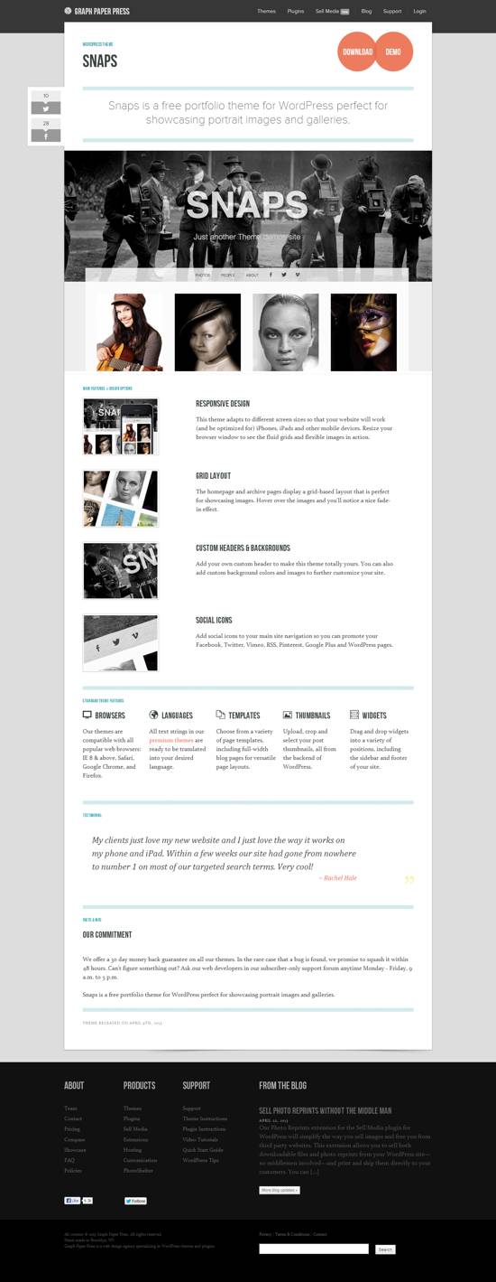
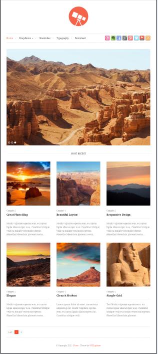
A responsive theme automatically reshapes its layout for the screen it is viewed on: desktop, tablet, or phone. Menus collapse into a mobile menu, columns stack vertically, and images scale so visitors never have to pinch and zoom. The themes in this collection were selected for exactly that behavior.
How can I test whether a theme is truly mobile-friendly?
Install the theme on a test site and run Google's mobile-friendly test, which flags usability issues directly. You can also preview the site at phone widths using Chrome's device toolbar, and browse it on your own phone. A theme that looks fine on desktop can still have cramped menus on a small screen.
Does a responsive theme help with search rankings?
Google treats mobile usability as a ranking factor, and a large share of web traffic now comes from phones. A responsive theme does not guarantee rankings, but it removes a common barrier. Fast load times and readable text matter just as much as the flexible layout.
Do I need a separate mobile theme or plugin?
No. A properly responsive theme handles all screen sizes from one codebase, which is the current standard approach. Separate mobile themes and mobile plugins were common years ago but are rarely needed today.



0 Comments