
Good type doesn't have to cost anything. This is a collection of 33 free fonts for designers — serifs, sans-serifs, scripts and display faces — each with a preview so you can judge it with your own eyes. One honest note: this is a classic collection from 2014, so treat it as a curated starting point rather than a what's-new list. And before you use any of these in client or commercial work, read the licensing notes at the bottom — it takes two minutes and saves real trouble.
- Best Free Fonts of 2013
- 60 Best Free Fonts of 2012
- 20+ Latest Free High Quality Fonts
- 20 Beautiful Free Fonts For Designers
Unleash Your Design Potential: A Guide to the Best Free Fonts
Adam by Shrenik Ganatra

Arenq

Asfalto
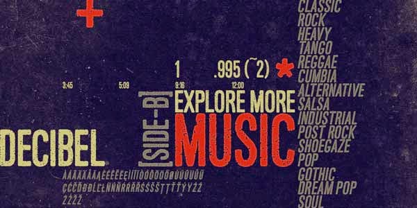
KH Idonx

Clocker

Mete

Southpaw
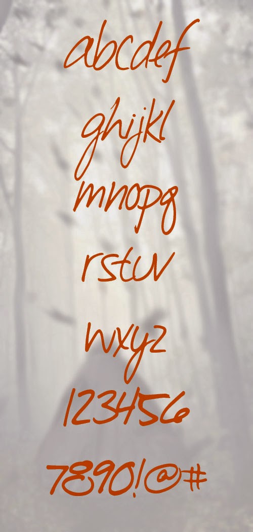
Siamesa

JustSpace

Rhino

Xmas Xpress
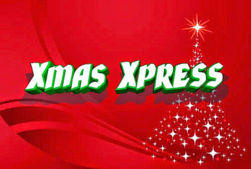
Brokeren

Zwodrei

Purbacala
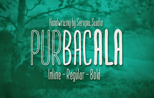
Dollar Bill
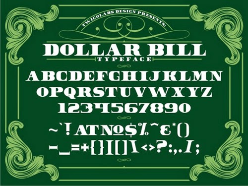
Barokah

Homizio Nova
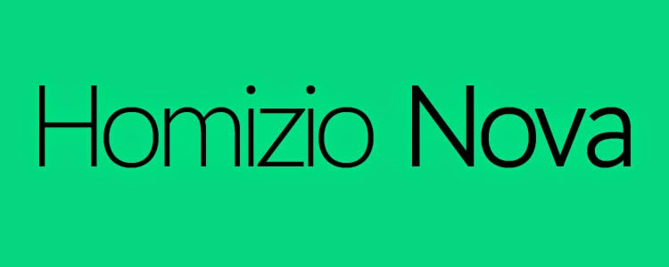
Margot by Adrià Gómez

Mohave
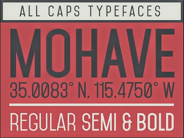
Nurjan

Odin Rounded

Ostrich Sans Heavy

Redressed

Bebas Neue (4 New Weights)

Biko

Borg
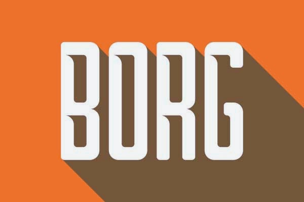
Canaro (Two free Weights)
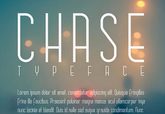
Chase
Falling by Viacheslav Olianishyn

Fancy Me

Genica

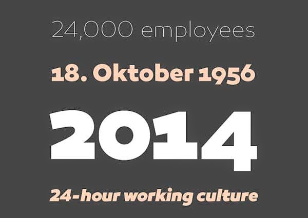
Hallo Sans

How to pick the right free font
- Match the font to the job. Body text lives or dies on readability — test it in a real paragraph, not just a headline. Save the dramatic display faces for titles and posters.
- Test at the sizes you'll actually use. A font that looks great at 72pt can fall apart at 12pt. Zoom out before you commit.
- Check the character set. If your project needs accented characters or numerals, make sure the font actually includes them — many free fonts don't.
- Pair with restraint. One serif plus one clean sans-serif is a combination that rarely fails. Two display fonts in one project almost always fight each other.
Free font licenses, in plain English
'Free download' and 'free to use commercially' are not the same thing. Many free fonts are free for personal projects only. Fonts released under the SIL Open Font License (OFL) can be used in commercial work, including client projects. The rule is simple: before a font goes into anything commercial, check its license file or the foundry's page. When in doubt, stick to OFL-licensed fonts from reputable libraries.
Installing a font
On Windows, right-click the downloaded font file and choose Install. On macOS, double-click it and choose Install Font in Font Book. Restart your design app and the font will be in your list.
Frequently Asked Questions
Are free fonts really free for commercial use?
Not automatically. Many free fonts are licensed for personal use only, which covers hobby and school projects but not client work or anything that earns money. Before using a font commercially, check its license — fonts under the SIL Open Font License or Apache License, like most of the Google Fonts library, are cleared for commercial use.
Where can I download free fonts safely?
Stick to established sources such as Google Fonts, Font Squirrel, Fontshare and Adobe Fonts, which list each font's license clearly. Random file-sharing sites are riskier: files may be mislabeled, bundled with junk, or posted without the designer's permission.
What is the difference between OTF and TTF fonts?
TTF is the older format and works virtually everywhere, while OTF is newer and can carry advanced typographic features such as ligatures and alternate glyphs. Both install the same way, and for most design work either is fine — designers usually pick OTF when both are offered.
How do I pair fonts without making a design look messy?
A reliable formula is one distinctive display font for headlines plus one clean, highly readable font for body text, with no more than two families per project. Make sure the pair shares a similar mood, and check that both licenses cover your intended use.



0 Comments