
Thin line icons are the quiet workhorses of interface design — simple, consistent strokes that label an action without shouting over it. This collection brings together 10 free thin line icon sets, each previewed below. Before you download, skim the notes at the end: five minutes on formats, consistency and licensing will save you real headaches later.
See Also:Elevate Your Designs: A Guide to Free Thin Line Icon Sets
Feather Icon Set

Free Budicon Icons

56 Thin Stroke Icons

OtherCircles Thin Line Icon Set
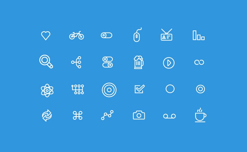
36 Line Icons by Ava

48 Icons by Robin Kylander

20 Thin Line Icons

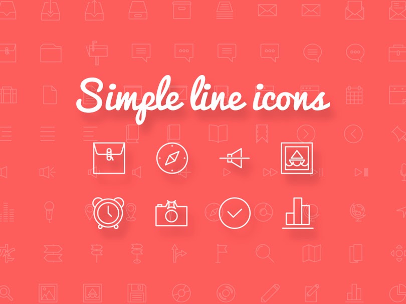
Simple Line Icons
Social Media Line Icons

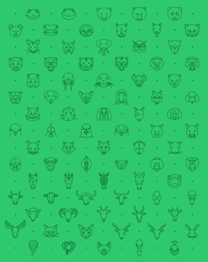
79 Animal Line Icons
Picking an icon set that won't fight you
- Consistency beats quantity. A set of 50 icons drawn with the same stroke weight and corner style is worth more than 500 mismatched ones.
- Prefer SVG. Vector icons scale from a 16px tab bar to a billboard without going soft. PNG is fine for quick mockups; SVG is what you ship.
- Check what's actually inside. Do you get the source files (AI, EPS, Figma) or just flat PNGs? Source files mean you can recolor and resize properly.
- One set per project. Mixing two different icon styles in the same interface is one of the fastest ways to make a design look amateur.
A note on licenses
Like fonts, free icon sets come with strings attached — personal-use-only is common. If the set will appear in a client project or a product, confirm commercial use is allowed before you commit to it.
Frequently Asked Questions
Can I use free thin line icon sets in commercial projects?
It depends on the license attached to each set. Many free icon sets are personal-use-only, while sets released under MIT, Apache, or CC0 licenses allow commercial use without credit, and CC-BY sets require you to credit the author. Always check the license page of the set before using it in client work or a product you sell.
Should I download SVG or PNG icons?
Download SVG whenever it is available. SVG icons scale from a 16px tab-bar icon to a billboard without losing sharpness, and you can recolor strokes with CSS. PNG versions are fine for quick mockups but get soft when scaled up and cannot be recolored cleanly.
What makes a good thin line icon set for a website or app?
Consistency matters more than the number of icons: icons drawn with the same stroke weight, corner rounding, and grid size look professional together. Also check that the set actually includes the specific icons you need and ships editable source files so you can adjust strokes and colors when your design evolves.
Is it okay to mix icons from different sets in one project?
Mixing styles is one of the fastest ways to make an interface look amateur, since stroke weights, corner styles, and optical sizes clash. If your main set is missing an icon, it is usually better to draw a matching one yourself or switch to a larger set than to pull a one-off icon from elsewhere.



.jpg)

1 Comments
Por otra parte el art.
ReplyDeleteReview my homepage - apuestas online