Responsive design is the process of creating a website working on Different platforms like Desktop, Tablet and Mobile. Responsive is very popular in now days because the usage of Tablets and Smart Phones. So here i Present a Collection of 40+ Useful Responsive Web Design Tutorials. Also check our previus post about
HTML 5 Tutorials. Hit the jump to check complete post.
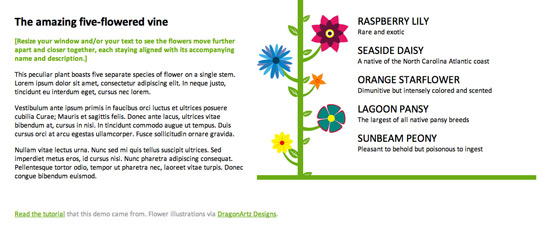
Responsive Design in 3 steps
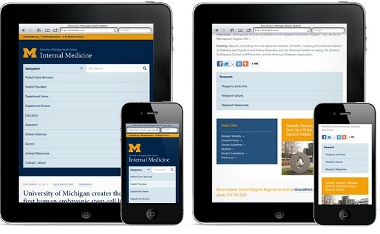
Responsive Web Design: What It Is and How To Use It
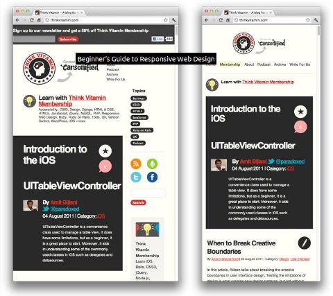
Beginner’s Guide to Responsive Web Design
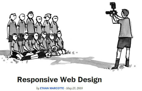
Responsive Web Design
Designing for a Responsive Web
Techniques in responsive web design
Responsive Design with CSS3 Media Queries
CSS-Only Responsive Layout with Smooth Transitions
Creating a Mobile-First Responsive Web Design
Responsive Web Design: Layouts and Media Queries
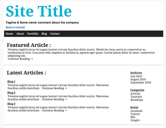
Create a Responsive Web Design Template
Building Fast and Resposnive Websites
Build a Responsive site in a week: media queries
Responsive Web Design Techniques, Tools and Design Strategies
How To Use CSS3 Media Queries To Create a Mobile Version of Your Website
Flexible Slide-To-Top Accordion
Beginner’s Guide To Responsive Web Design
Adaptive Layouts With Media Queries
Responsive Content Navigator With CSS3
Responsive Data Tables
How To Use CSS3 Orientation Media Queries
Convert A Menu To A Drop Down For Small Screens
Elastic Videos
Fluid Images
Fluid Grids
AN INTRODUCTION TO RESPONSIVE WEB DESIGN
Responsive Horizontal Layout
CSS Effects: Space Images Out To Match Text Height
Introduction To Responsive Web Design: Video
Scalable Navigation Patterns In Responsive Web Design
Optimizing Your Email For Mobile Devices
Responsive Design In 3 Steps
Responsive Web Design With CSS3 Media Queries
How To Build A Responsive Thumbnail Gallery
Designing For A Responsive Web
Responsive Web Design With HTML5 & Less Framework 3
Fluid CSS3 Slideshow With Parallax Effect
Create A Responsive Web Design Template
Responsive Web Design: A Visual Guide
Responsive Website Navigation
Responsive Resume
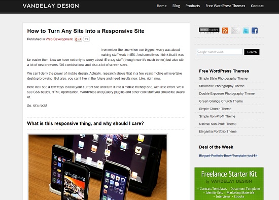
How To Turn Any Website Into A Responsive Site
Hiding And Revealing Portions Of Images
Build A Responsive Mobile-Friendly Website With Skeleton
Frequently Asked Questions
What is responsive web design?
Responsive web design is the practice of building websites that adapt to different screen sizes and devices automatically. Instead of separate desktop and mobile sites, one flexible layout rearranges itself for phones, tablets and desktops.
What are the core techniques behind a responsive website?
There are three building blocks: a viewport meta tag that tells mobile browsers how to scale the page, fluid grids that size layout elements in percentages instead of fixed pixels, and CSS media queries that apply different styles at specific screen widths. Flexible images that never exceed their container's width complete the picture.
Should I design mobile-first or desktop-first?
Both approaches work, but mobile-first is the common recommendation for new projects: you write the base styles for small screens, then add min-width media queries for larger screens. If you already have a finished desktop design, a desktop-first approach with max-width media queries is a practical way to adapt it.
How do I test whether my website is truly responsive?
Resize your browser window and watch for layouts that break or overlap, then test in your browser's developer tools device toolbar to simulate phones and tablets. Always do a final check on real devices too, since touch targets and font sizes that look fine in emulation can feel cramped on an actual phone.






















6 Comments
Nice Article ! We can consider web design as a combination of planning + mixing text, images, and multimedia files to form a professional web design. Web designers utilize HTML for the website structure and CSS for adding their final touch from colors, fonts, alignment. Javascript is important as well to create an interactive page.
ReplyDeleteBut the point that web designers should be more familiar with the new web design techniques such as responsive web designs. Nowadays, huge traffic is coming from hand-held devices such as tablets and smart phones. A responsive web design will work on any device with no problem.
Thank you,
Marc A. Donald
web design bahrain
Good tutorials about web design with good functions.
ReplyDeleteIt is good way to get all design tips to get perfect website
ReplyDeleteIt is a good way to test all things out about the responsive web design tutorials.
ReplyDeleteWhere to find all things like these responsive web design.
ReplyDeleteHow do we check to see if all of them can work out for all design
ReplyDelete